The Hashtag (#) Visualizer

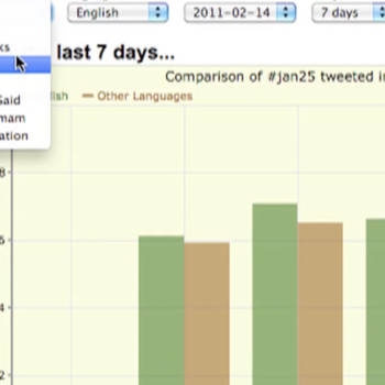
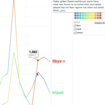
The Hashtag Visualizer is a live, interactive graph that allow users to analyze big data dynamically. It shows you the top 50 Words in Hashtag Feeds over Time. The visualizer uses R-Shief’s real-time archive of over five billion tweets since 2010, allowing you to search through the few thousand hashtag feeds and break down conversations quickly. Users can also specify a keyword and analyze an individual keyword (e.g. Gilani) or a pair of keywords (e.g. Drone and FATA) to come up with very insightful with useful datasets. It also provides users with powerful graphing functions and ability to quickly visualize discussions to easily spot trends and influential people. By hovering your mouse over the timeline, word clouds generate dynamically. These interactive media allow users to apprehend real-time levels of tweets, and in some cases, to predict a story’s arc and tone in the traditional media by measuring volume of keyword hashtags.